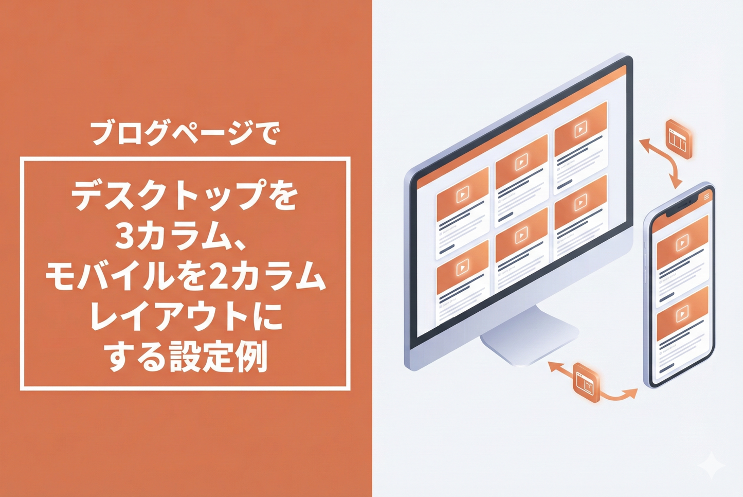
You can change the layout to three columns on desktop and two columns on mobile simply by adding custom CSS to the blog post section of your blog template in the theme editor.
◆ Benefits of implementation ・Article lists are compact, improving user navigation ・Optimal display for each device, significantly improving readability
◆Specific steps ・Select the blog post section of the collection template ・Add styles for layout adjustment to the custom CSS section
Example of a blog page with the theme "Dawn/Rise" with a 3-column layout for desktop and a 2-column layout for mobile.

[(For Rise/Dawn Themes) How to Set Up] Collection Template: Adding Styles to Custom CSS for the Product Grid Section


