
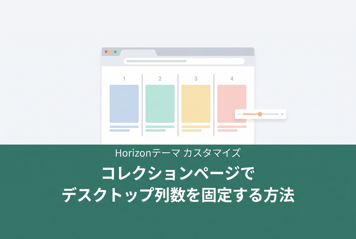
A custom section implementation for fixing the number of PC columns on Horizon theme collection pages. Adds a "Grid Mode" setting to the theme editor, letting you switch between Horizon's default card-size-based auto layout and a fixed 1–8 column layout.


How it works
Horizon's default grid uses repeat(auto-fill, minmax(165px, 1fr)) to determine column count automatically based on viewport width. This can conflict with your intended layout design.
This custom section overrides the CSS variable --product-grid-columns-desktop with repeat(N, 1fr) only when "Fixed columns" mode is selected. The selector is scoped to the section ID, so no other collections or sections are affected.
Implementation
1. Create the custom section file
Create a new file custom-main-collection-fixed-columns.liquid in your theme's sections/ folder. Copy the contents of the standard main-collection.liquid and add the following two pieces.
First, add a CSS variable override block immediately after </results-list>.

Next, add the "Grid Mode" and "PC Columns" settings at the top of the settings array inside {% schema %}.

2. Create the template JSON
Create a new file collection.fixed-columns.json in your theme's templates/ folder. Copy the standard collection.json and change the main section's "type" to "custom-main-collection-fixed-columns".

3. Assign the template to a collection
In the Shopify admin, go to Products → Collections, open the target collection, and select fixed-columns from the "Theme template" dropdown in the right sidebar.

Once assigned, open the theme editor for that collection and switch "Grid Mode" to "Fixed columns," then set your desired column count with the "PC columns" slider.
Notes
- When "Grid Mode: Size-based" is selected, the default auto-fill behavior is preserved
- The CSS variable override applies only to desktop (750px and above). Mobile column count follows the standard "Mobile card size" setting
- If using the grid zoom-out density toggle, the fixed column count is disabled while zoom-out is active
Related TIPS: Display a banner image in the middle of a collection page